Email is great. But it’s not without its pitfalls.
We can think of a few occasions when we’ve offended someone when we hadn’t meant to and vice-versa.
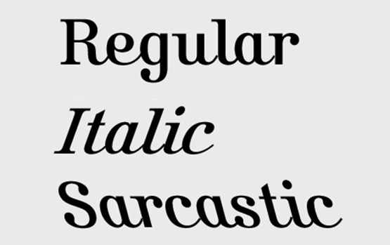
So we were wondering if all system fonts should have an extra cut which can be used to better communicate sarcasm or irony?
(We’ve used the lovely KURSIVSCHRIFT, here.)

